← Browse Dives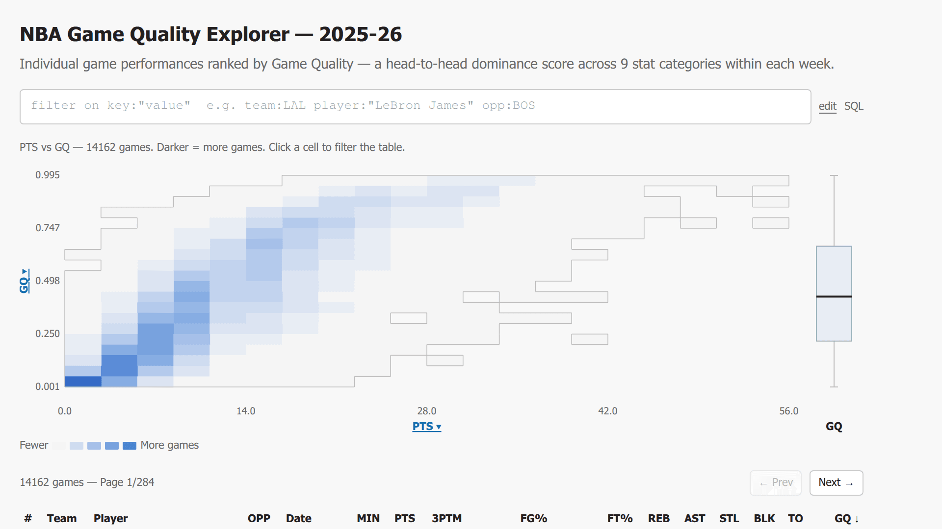
Loading Interactive Dive...
NBA Game Quality Explorer — 2025-26
Interactive NBA Game Quality explorer with Datadog-style key:value filter bar (Tab autocomplete, auto-close quotes, IN lists with bracket syntax, numeric comparisons, date part filters), edit/SQL toggle, 20x20 heatmap with contour edges and anchored axes, clickable axis label dropdowns, GQ box plot with player tick marks, orange dot overlay via player filter or dots:true directive, heatmap:true to apply filters to heatmap, sortable paginated table with click-to-filter rows.
Author: Jacob Matson · February 25, 2026 Region: us-east-1
AI Prompts Used
1Prompt 1
I have an NBA box scores share at md:_share/nba_box_scores/c9126ae3-ef30-4b6e-af8e-d2212c1f2797. It has tables box_scores_gq, box_scores, and schedule. Can you explore the schema of each table and show me what's in them? Then build a simple dive that queries individual player game performances for the 2025-26 season (games since 2025-10-20), joining box_scores_gq with box_scores (on game_id and entity_id, where period='FullGame') and schedule (on game_id). Show a sortable, paginated table with columns: Team, Player, Opponent, Date, MIN, PTS, 3PTM, FG%, FT%, REB, AST, STL, BLK, TO, and Game Quality (GQ). Sort by GQ descending by default. 50 rows per page.
Note:Data exploration & basic table
2Prompt 2
Add a 20×20 bin heatmap above the table that plots two stats against each other — default to PTS (x-axis) vs GQ (y-axis). Use a blue gradient color scale (lighter = fewer games, darker = more). The axis bounds should be anchored to the full dataset so they don't shift when filters are applied. Add tick labels on both axes. Show a tooltip on hover with the game count for that cell. When you click a heatmap cell, it should cross-filter the table to only show games in that bin. Add a “clear” link to remove the cell selection.
Note:Heatmap visualization
3Prompt 3
Make the X and Y axis labels on the heatmap clickable. When clicked, show a dropdown menu that lets you switch the axis to any of these stats: PTS, REB, AST, STL, BLK, TO, 3PTM, FG_V, FT_V, GQ. The dropdown should highlight the currently selected stat and close when you click outside it. Changing an axis should clear any selected bin.
Note:Clickable axis dropdowns
4Prompt 4
Add a narrow vertical box plot to the right of the heatmap showing the distribution of Game Quality scores (min, 25th percentile, median, 75th percentile, max). It should use the same data source as the heatmap and be vertically aligned with it.
Note:GQ box plot
5Prompt 5
Replace any simple filter inputs with a single Datadog-style key:value text input filter bar. It should support these filter keys:

String filters (case-insensitive contains): team, player, opp/opponent, date
Numeric filters (supports >, >=, <, <=, =): pts, reb, ast, stl, blk, to, 3ptm, min, gq, fg%, ft%, fg_v, ft_v
Date part filters (numeric): year, month, day, week

Example usage: team:LAL player:"LeBron James" pts:>=30 month:>=12
Support quoted values for multi-word strings, IN-list syntax with brackets like team:[LAL,BOS,GSW], and multiple filters combined with AND logic. Add a clear (✕) button.
Note:Datadog-style filter bar
6Prompt 6
Add Tab-key autocomplete to the filter bar — when the user starts typing a key name and hits Tab, autocomplete it to the nearest matching key followed by a colon. Also add auto-close quotes: when the user types ", automatically insert a closing " and place the cursor between them. If the cursor is right before an existing closing quote, skip past it instead of inserting another pair.
Note:Tab autocomplete and smart quoting
7Prompt 7
Next to the filter bar, add small "edit" and "SQL" toggle links. In "edit" mode, show the normal editable filter input. In "SQL" mode, show a read-only rendering of the current filters translated to SQL WHERE clause syntax (e.g., WHERE team_id ILIKE '%LAL%' AND points >= 30). This helps users understand exactly what the filters are doing.
Note:Edit/SQL toggle
8Prompt 8
When a player: filter is active, overlay orange dots on the heatmap showing where that player's filtered games fall (with jitter so overlapping dots spread within a cell). Also add horizontal orange tick marks on the GQ box plot for those games. In the table, highlight matching player rows with a light orange background. Additionally, support a dots:true directive in the filter bar that shows dots for ALL currently filtered games (not just player-filtered ones).
Note:Orange dot overlay & player highlighting
9Prompt 9
Make table rows clickable. Clicking a row should toggle a player:"Player Name" filter in the filter bar. If that player is already filtered, remove the filter. This creates a quick way to drill into a specific player's games.
Note:Click-to-filter table rows
10Prompt 10
Add two more special filter directives:

heatmap:true — when present, the heatmap should reflect the currently filtered data instead of always showing the full dataset.
top:N — limits the result set to the top N rows by the current sort column/direction.

Also add contour edges to the heatmap — draw thin gray border lines along the edges where filled cells meet empty cells, to give the data shape a cleaner outline.
Note:heatmap:true directive and top:N
11Prompt 11
Polish the whole dive:

Title: "NBA Game Quality Explorer — 2025-26" with a subtitle explaining GQ is a head-to-head dominance score across 9 stat categories within each week
Add a color legend bar below the heatmap (Fewer → More games)
Show FG% and FT% in the table as 0.545 (+3.2) format showing the percentage and the value-over-expected
Add a help text footer listing all available filter keys with an example
Make sure the design is clean with system-ui font, light gray background, and consistent spacing
Note:Final polish
Comments
Log in to leave a comment.
No comments yet. Be the first!