← Browse Dives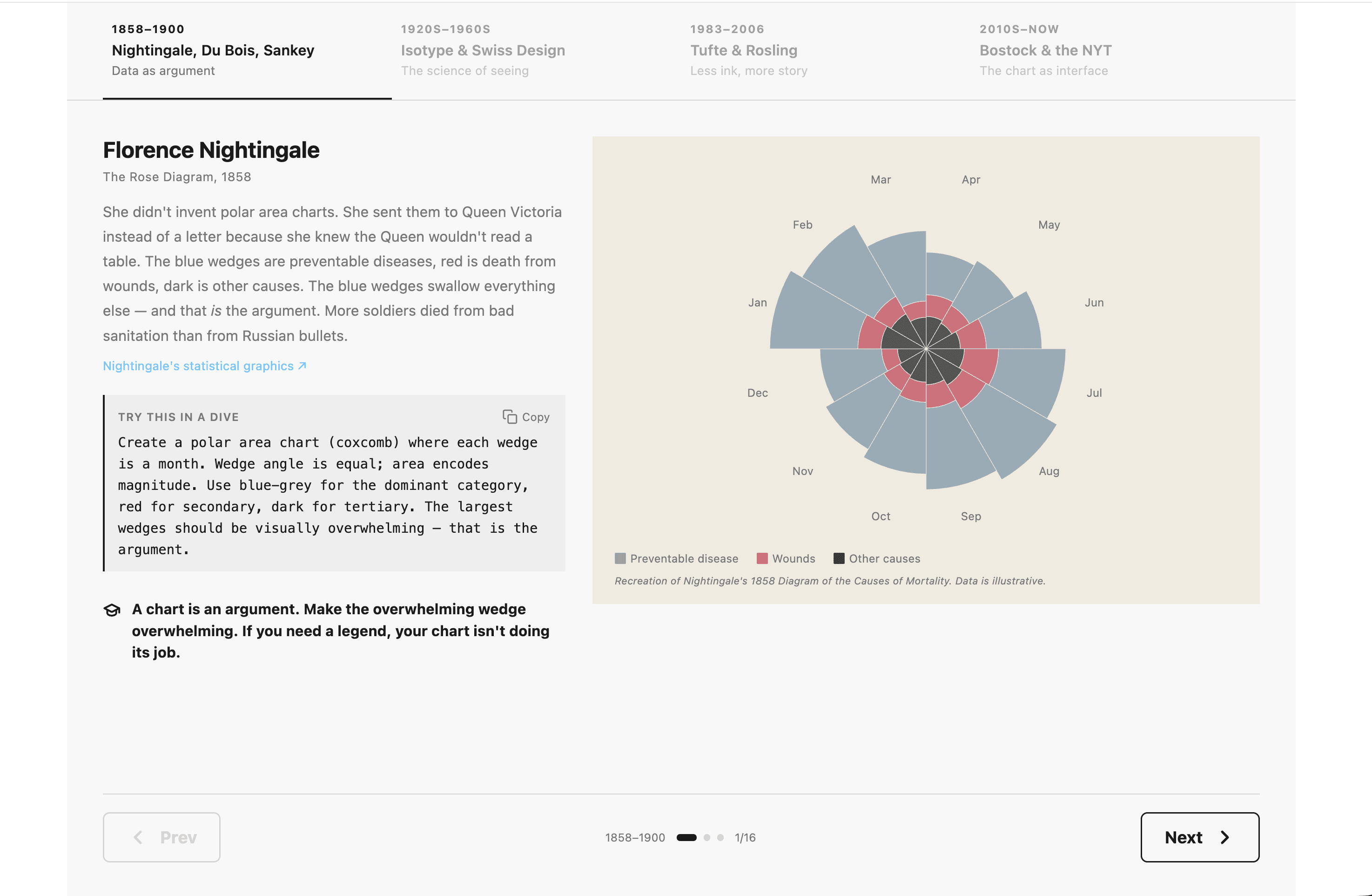
Loading Interactive Dive...
A Visual History of Data Visualization
An interactive guide through four eras of data visualization history — from Nightingale's rose diagrams to D3.js interactive charts. Features recreations of iconic chart types using WHO air quality data, with Swiss/International Style design principles throughout.
ShowcaseData Viz
Author: Dumky de Wilde · March 25, 2026 Region: us-east-1
AI Prompts Used
1Prompt 1
Build a MotherDuck Dive (React data app) that guides users through key moments in the history of data visualization, organized as a slideshow with tabbed navigation. The design should follow Swiss/International Style principles: minimal color, strong typography, generous whitespace, and grid alignment.

Structure:

4 tabbed eras in a header bar, each tab showing the era title, year range, and a short tagline:
Pioneers (1800-1930): Nightingale, Du Bois, Minard — “Changing lives with data”
Grammarians (1930-1970): Isotype, Gestalt, Swiss Style — “The grammar of graphics”
Minimalists (1970-2000): Tufte, Few, Cleveland — “Data-ink ratio”
Interactive (2000-present): Bostock, D3, NYT — “The web as canvas”
Clicking a tab shows that era’s content as a full page below the tabs (slideshow effect)
Each tab includes a “Next” button at the bottom to advance to the next era
Per-era content pattern (using SplitRow 2/5 + 3/5 responsive layout):

A recreation of an iconic chart type from that era (using D3.js for custom charts like rose diagrams, Sankey, box plots, bubble charts; Recharts for simpler charts)
1-2 paragraphs explaining historical significance and what we can learn from it
A Wikipedia link to the key figure
A copyable “Try this in a Dive” prompt (with copy button) that users can paste into MotherDuck to recreate the chart style
A KeyLesson callout (graduation cap icon + bold text, no border, Swiss style)
Design tokens (T object):

fg: "#1a1a1a", muted: "#777", rule: "#d4d4d4", bg: "#f8f8f8", sand: "#f0ebe0", link: "#6FC2FF", accent: "#6FC2FF"
MotherDuck brand colors: Sky #6FC2FF, Garden #16AA98, Sun #FFDE02, Watermelon #FF7169, Neutral-900 #383838
Font: system sans-serif for body, monospace for code
Shared components:

SplitRow: responsive two-column layout (2/5 text + 3/5 chart, stacking on mobile)
SectionTitle, WikiLink, DivePrompt (with copy button), KeyLesson
ChartFrame (sand background + legend + footnote), ChartFootnote, LegendRow
NextTabButton at the bottom of each tab to advance
Chart implementations per tab:

Pioneers: NightingaleRose (D3 polar area), DuBoisBars (HTML/CSS stacked bars), SankeyDiagram (D3 flow, width=640)
Grammarians: Isotype dots (black bg, white+yellow dots using live WHO data via useSQLQuery), GestaltBars + GestaltDots, GridDemo (CSS grid KPIs), TypographyDemo (Vignelli poster), WhitespaceDemo (D3 before/after)
Minimalists: TufteBoxPlot (D3 traditional vs Tufte side-by-side), SparklineTable (inline SVG sparklines), SmallMultiples (3x2 grid), RoslingBubbles (D3 animated bubble chart with play/pause, year stepper, ghost trails)
Interactive: HighlightBars (pure HTML/CSS hover bars), AnnotatedChart (D3 line chart with callout annotations), StepperChart (4-step narrative with hover details), D3HoverChart (D3 bubble chart with crosshairs)
Technical requirements:

Use useSQLQuery from @motherduck/react-sql-query for at least one live query (WHO air quality data from sample_data)
Use useRef + useEffect pattern for D3 charts within React
D3 v7, React 18, lucide-react for icons
All fake/illustrative data inline for historical chart recreations
Progressive loading with inline skeletons for data-dependent sections
Comments
Log in to leave a comment.
No comments yet. Be the first!